Meet the Green Team with High QA's New Look
High QA
November 5, 2021
”Innovation is to see what everybody else has seen, and to think what nobody else has thought.
Albert Szent-Gyorgyi, Hungarian biochemist who won the Nobel Prize in Physiology or Medicine in 1937
Innovation is a key foundation of High QA. We looked at how quality was managed in manufacturing industries and thought:
What if we did it differently?
What if there is a better way?
What if this can be automated?
We answered those “What if” questions with a revolutionary software to streamline, automate and optimize quality in the manufacturing industry. It is one-of-a-kind and something you shouldn’t be without.
Time for a Change
The innovations and technology have evolved and grown since High QA was founded in 2008 and now, we felt it was time for a change to the logo and brand. We have refreshed our logo and visual brand to reflect where we have come from and to boldly move forward as we spearhead a paradigm shift in the quality industry.
After careful consideration, we chose a new brand identity and logo that reflects a more modern look and captures our vision to position High QA as the most complete, innovative and robust quality management system for manufacturing.
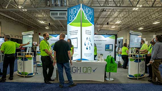
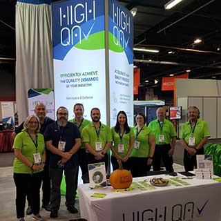
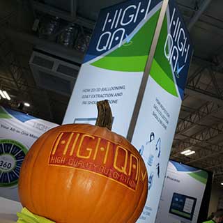
We showed our fresh look at EASTEC 2021 and the 2021 Quality Show. Attendees of the shows described our booth as “noticeable, vibrant and refreshing.”
We also quickly became known as the “Green Team” and the “Glowing Tower Booth.”
The Logo
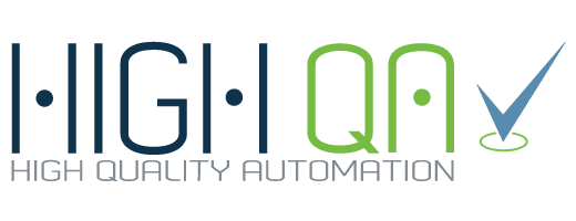
Our logo reflects who we are today and retains the core element of the original logo as a nod to our rich history and deep roots.
Font
The font for the logo is the original font used when High QA was founded. It represents the history of the company and ties back the original founding members. The font represents a robotic, mechanical, high tech look that identifies High QA as innovative leaders in manufacturing quality software technology.
Colors
Blue and green are the primary colors used in the logo and visual branding. Accents colors are lighter blue and gray.
Navy Blue

Navy Blue represents industry and technology as well as loyalty and dependability which are key parts of the culture at High QA.
Lime Green

Lime green is a bold choice to highlight QA – Quality Assurance/Automation. It represents growth, clarity and reliability. All characteristics of High QA.
New Icon
The checkmark in the logo is a new feature. While it is a simple addition, it has great meaning. The checkmark represents a checklist or items in a form that are often found in the manufacturing quality process. It is also a mark that is often used when an item is completed with an indication of acceptance and is ready to move on in the process.
The small circle under the checkmark represents our High QA 360 platform, which is the foundation for all our software products, applications and modules.
You will start to see the checkmark icon used more in association with High QA.

Changing the logo and branding is a process. We have just started but soon the website and brochures will be updated. When you attend manufacturing shows, just look for the people in the bright green shirts. We are pretty easy to find.
The new brand identity and freshly revamped logo better reflect our passion and demonstrate the breadth and depth of what we will bring to increasing quality in manufacturing.

See the innovations for yourself. High QA software automates and optimizes your quality management process with tools to maintain, validate and report compliance with industry standards and regulations. So, what are you waiting for? Request a demo today to see the most powerful quality management software that currently exists.
For more information, visit www.HighQA.com or contact a High QA representative for a free no-obligation demo of Inspection Manager, the ultimate manufacturing quality management software.


